
When your architecture diagram only exists as a picture
A whiteboard photo, a screenshot in an old deck, a PNG in the wiki — often the only copy of a system diagram is an image. What recovering it as an editable file got right on a real diagram, and what it got wrong.
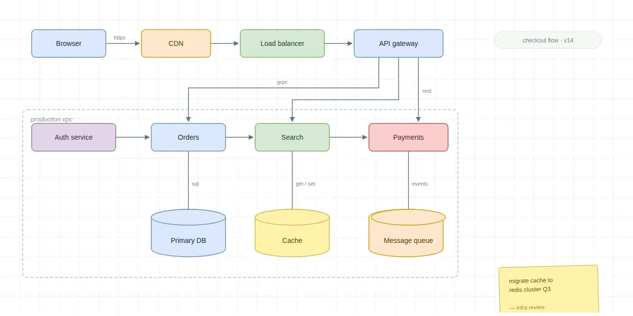
When the only copy of an architecture diagram is an image, you can recover it as an editable Draw.io file instead of redrawing it: the boxes and their labels come back as real shapes you can move, and the arrows come back as connectors. On the real example below, every box and every arrow came back — but the small words written along the arrows did not, and a few of them came back wrong. It is a draft to check, and this post is about what exactly to check.
How does a diagram end up as only a picture?
The usual ways. A design session ends and someone photographs the whiteboard. A system is explained once in a slide deck, and the deck survives while the source file does not. A PNG gets pasted into the wiki by the person who then leaves. Six months later the diagram is needed for a review, it gets redrawn from memory, and the redraw gets a detail wrong that nobody can check.
A picture cannot be searched, diffed against next quarter's design, or edited when the system changes. A diagram file can.
What does "recovered" mean?
Not a trace. Image to Draw.io measures the boxes from the pixels, reads the labels, follows the arrow strokes, and attaches each connector to the shapes it joins. The result behaves like a diagram: drag a node and its edges go with it, retype a service name in place, export Draw.io XML that opens anywhere mxGraph files are read.
The diagram at the top of this post went in as a flat image. This is what came back:
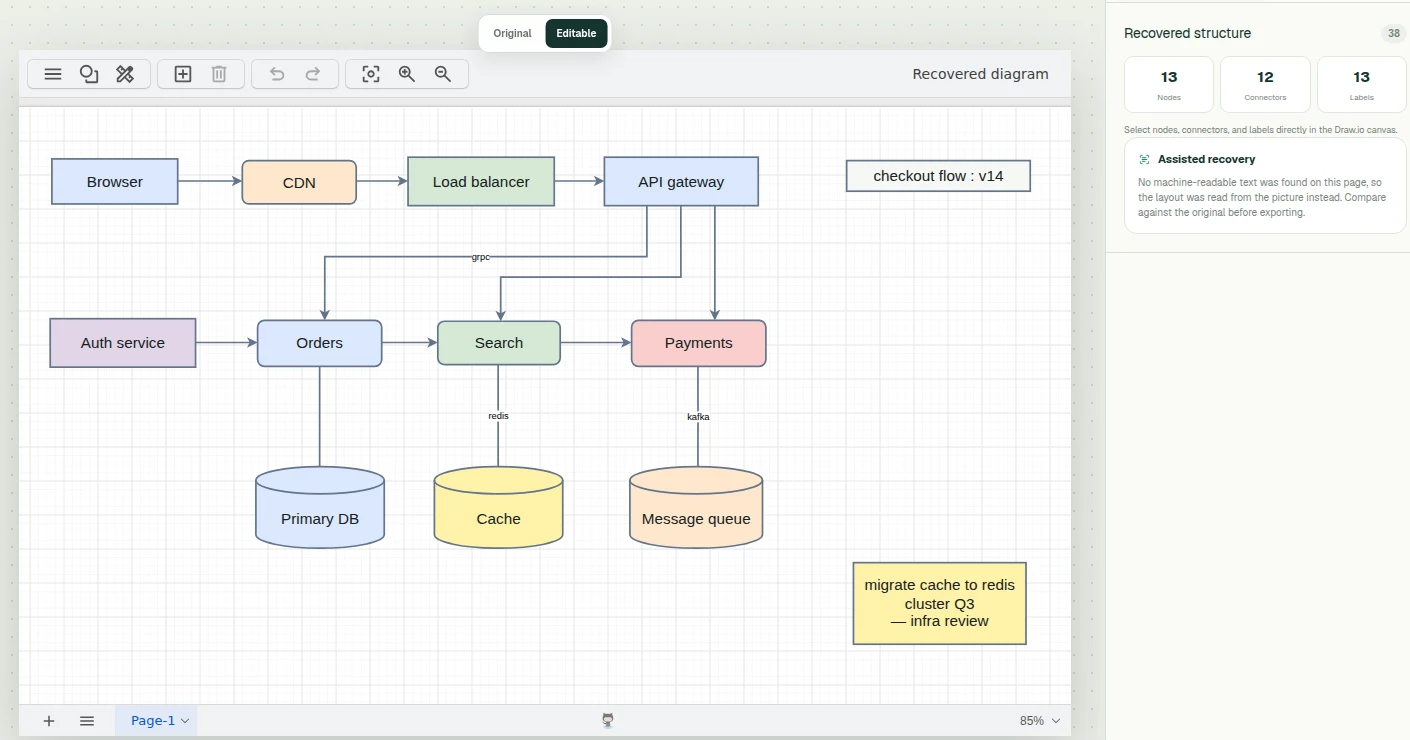
What did it get right, and what did it miss?
Most of it. Taken from the recovered file itself — which boxes each connector is actually attached to, not how it happens to be drawn:
- Every box came back, in its place, with its label and its fill colour: the eleven services and stores, plus the version tag and the sticky note. The three data stores came back as cylinders.
- All twelve connectors are joined to the right two boxes. The nine arrows point the right way, and the three plain lines down to the data stores stayed plain lines.
- The dashed "production vpc" boundary is gone, and its label with it. The boxes it grouped are all there, just no longer inside anything.
- The words on the lines are the weak part. The original has six. One came back right (grpc), three came back missing (https, rest, sql), and two came back as words the original does not have: get / set became redis, and events became kafka.
Those last two are the ones worth dwelling on. They are plausible — a cache next to the word redis, a message queue next to kafka — which is exactly why they are easy to miss. A missing label is obvious; a wrong one that sounds right is not. The smaller slips are of the same kind: the tag's "·" came back as ":", and some rounded corners came back square.
So the check that matters is not "does it look like the original", which it largely does. It is: read every word on a line against the original, then drag each box and watch which lines come with it. The original stays one click away in the editor for exactly this comparison, and each fix is a retype or a drag rather than a redraw.
Is a whiteboard photo harder?
Yes. The example above is a clean export, which is the easy input — and it still needed its line labels checked, which is worth saying plainly, because a clean export is the one every tool in this category shows. A photographed board adds a perspective the lens was not square to, a light reflection across some of the writing, and hand-drawn boxes without the consistent borders box detection leans on.
Clear structure — boxes with borders, arrows with arrowheads, one label per edge — gives the best start. Dense freehand sketching comes back as a rougher draft with more arrows to fix. Either way the boxes and labels are the part you do not have to retype, and ten minutes of dragging connectors beats redrawing the whole thing from memory. Whiteboard photo to diagram covers how to photograph a board so it can be read.
The steps
- Open Image to Draw.io and upload the picture.
- Read every label on a line against the original, then drag each box and watch which lines come with it: is every arrow there, joined to the right two boxes, pointing the right way?
- Fix what is wrong by reconnecting, dragging and retyping.
- Export the XML and put it where the next person will find it — versioned, searchable, and checkable against the next redesign.
Questions
- What does it produce?
- Standard Draw.io XML — nodes, connectors and labels that open in diagrams.net and any tool that reads mxGraph files.
- Will the connectors follow the nodes?
- They come back as edges attached to shapes, so dragging a node carries its arrows with it — which is also the quickest way to find an arrow attached to the wrong shape. Check every edge is there, joins the right two boxes, and points the right way.
- Does it work on photographed whiteboards?
- When boxes and arrows are clear, yes. A photo is a harder input than a clean export, so expect more to correct — the whiteboard page covers how to photograph a board so it can be read.