
Fix text in an AI-generated image without regenerating it
Re-running the prompt to fix one wrong word throws away the picture you liked. Mark the words instead, and take back only those — every other pixel stays yours.
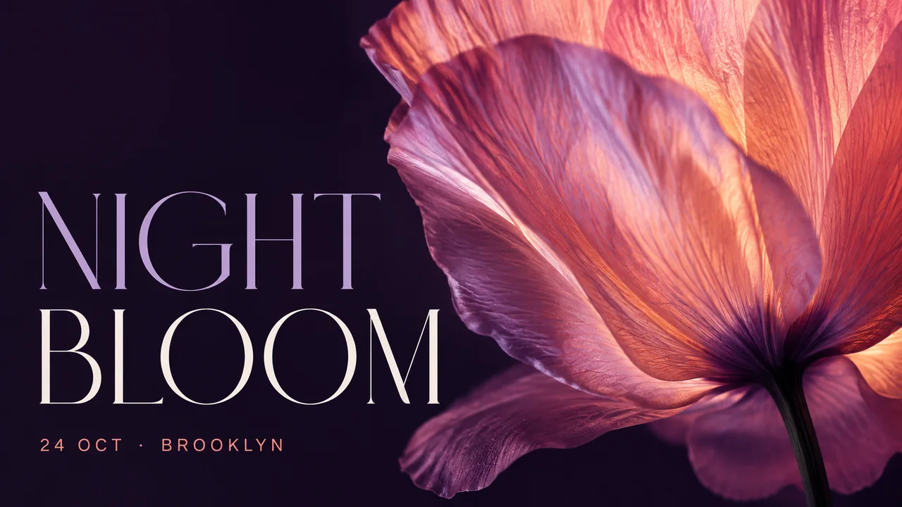
To fix a wrong word in an AI-generated image, don't re-run the prompt: mark the words that are wrong, type what they should say, and keep only those lines from the model's answer. The rest of the picture — the composition, the faces, the colours you liked — stays the exact file you started with.
Re-running the prompt is the usual advice, and it treats the image as cheap. If it is a poster you spent an evening on, a product shot you finally got right, or a slide someone already approved, a regeneration is not a fix. It is a new picture that happens to be similar: the colour drifts, the composition shifts, the face is subtly different, and the typo is now some other typo.
Why does re-running the prompt not fix the typo?
Because the thing that made the typo is the thing you are asking to fix it. Rendering legible text has been the most-reported weakness of image models since they appeared, and new models still announce better text as a headline result — as in OpenAI's introduction of 4o image generation. A re-roll is the same dice again, and it re-rolls everything else in the frame with them.
How do you change only the words?
Edit text in an image splits the job in two. The model still does the drawing — it is shown exactly which words to change, marked on the image, and returns the picture with them changed. But what you get back is not the model's picture. Only the marked lines are taken from its answer and laid back onto your original.
Here is the poster above with its headline changed to AFTER DARK:
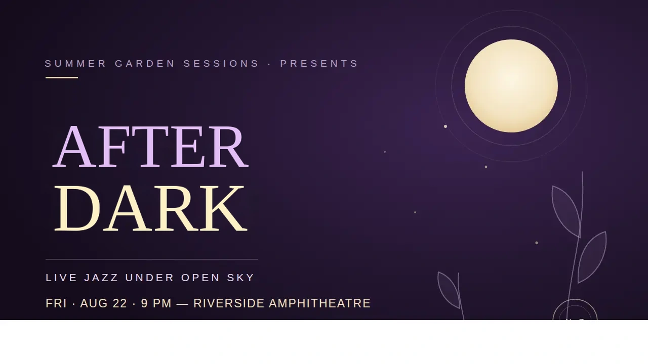
What actually changed?
"Only the marked lines" is a claim you can check. Subtract one file from the other, pixel by pixel, and this is where they differ:
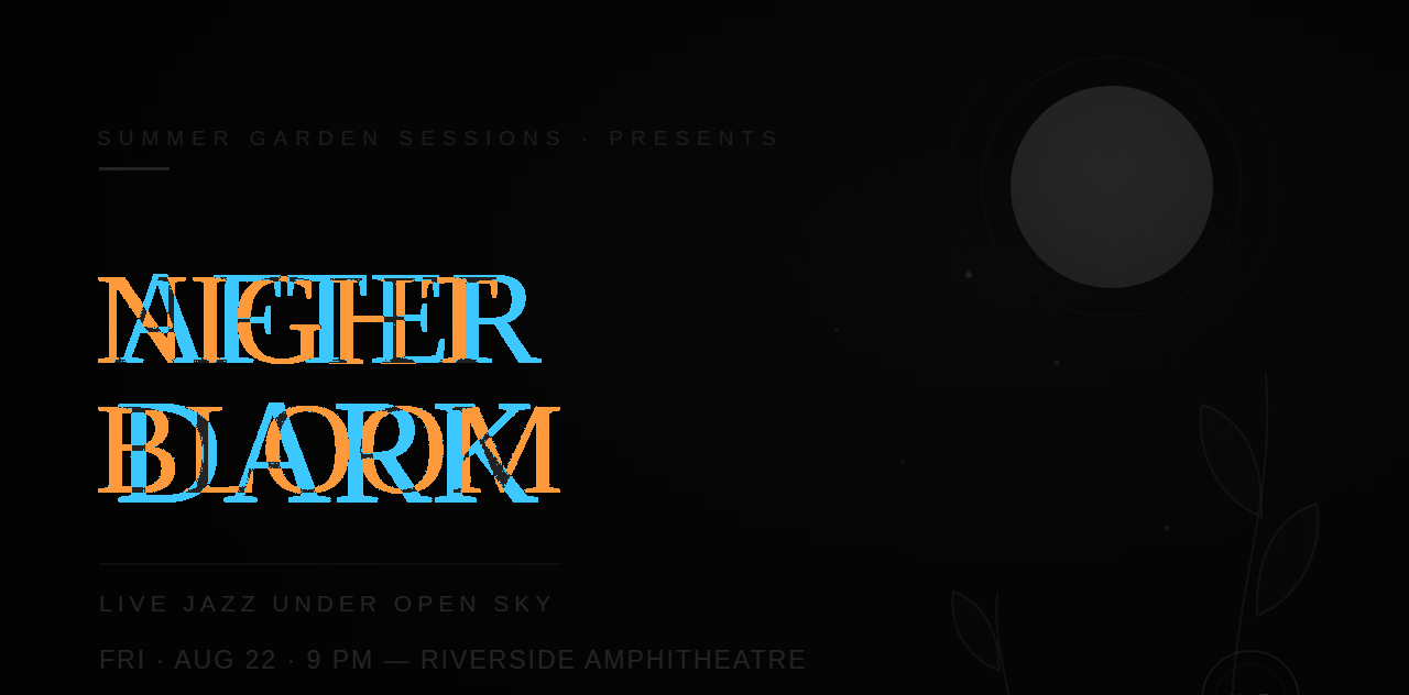
Every change is in the headline: the strokes of NIGHT BLOOM that were erased, and the strokes of AFTER DARK drawn in their place, overlapping where the two words cross. The moon, the vines, the gradient and every line of small type are untouched — under 4% of the frame changed, all of it inside the headline.
One honest footnote if you try this yourself on the images on this page: they are compressed for the web, and compression leaves faint noise along every sharp edge — at most 22 levels out of 255 here. The map above shows differences larger than that. The file the editor gives you is a lossless PNG, so there is no such noise to see through.
That is the difference from a regeneration, which would have touched every one of those pixels a little.
Why this matters most for screenshots
A headline with last quarter's date, a button with the old name, a "coming soon" that shipped — in a screenshot, the picture around the words is already correct. Regenerating it asks a model to imagine what your product looks like, and it will confidently imagine something adjacent. Taking back only the words leaves the interface exactly as it shipped.
When should you use the whole redraw instead?
The default has one weakness. Where the new words sit on a textured background — a photograph, grain, a pattern — the edge between the model's ground and your original can show as a faint outline around the new text. For that case the result has a Whole redraw switch: the model's full picture, with no edge, at the cost of small details elsewhere shifting. It is the same answer, so switching costs nothing; whichever is on screen is what downloads.
Where it works, and where it does not
- Comfortable: typeset words on flat, graded or evenly textured backgrounds — posters, slides, UI screenshots, banners. A handful of words at a time.
- Harder: words on busy photographs, where the background behind the old letters has to be invented and fine texture is approximated rather than recovered.
- Not today: lettering that is itself the artwork — a hand-drawn logo, a title painted into an illustration. Replacing it gives you clean type where the drawing used to be.
On the typeface: nothing that works from pixels can recover the original font file, and identifying one is its own unsolved problem — services like WhatTheFont exist for exactly that. The new words are drawn to resemble the lettering around them. On a short headline that carries most of the resemblance; on a logo it does not, and a logo is the case to take elsewhere.
The steps
- Open Edit text in an image and upload the picture.
- Draw a box around each piece of text to change, and type what it should say.
- Press Redraw — about a minute, one price however many boxes are in the round.
- Compare against the original, switch to Whole redraw only if you see an edge, then download the PNG.
If the point is to match the lettering as closely as an image allows, that case has its own page.
Questions
- Does fixing the text change the rest of the image?
- Not by default. The model redraws the picture, but only the lines you marked are taken from its answer; outside them every pixel is the original. The Whole redraw switch uses the model's full picture instead, for the rare case where the default leaves a visible edge.
- What kinds of text can it fix?
- Typeset words on reasonably even backgrounds — headlines, labels, buttons, dates, prices. Lettering drawn into dense artwork is harder, and the result should be compared against the original before export.
- Will the new words match the original font?
- They are drawn to resemble the lettering around them, but no tool working from pixels can recover the font file, and an exact match is not guaranteed. Short headlines in clear lettering match best.